7 UX Mistakes Hurting Your Property Website
Does your website have what it takes to capture the ever-elusive renter?
If you’re puzzled by the question, that’s okay. It’s not an easy one to answer.
A cool layout? It’s cooler than being cool. Good content? You wrote it with the renter in mind. Great photos? The model was captured to perfection. An FAQ and Neighborhood page that would do any search engine optimizer proud? Check and check!
It seems like you’re doing everything right, but something isn’t working because traffic isn’t converting.
So, what is it?
1. Sticker Shock
Savvy renters are planning their budgets down to the penny, and when your website says “starting at” or “call for pricing,” they will bounce because no one has time to be playing guessing games with their money.
There are also fees beyond the base rent that renters have to consider before even thinking about browsing photos or scheduling a tour. These additional costs may include:
- Security deposit and administrative fees
- Pet deposits and pet rent
- Parking fees
- Trash, water, and sewer
As more states adopt
fee transparency mandates, clear, uncomplicated pricing on your website is becoming increasingly important.
2. Timing is Everything
Moving is considered a stressful life event. Renters will develop decision fatigue, completely disrupt their routine, and experience financial strain.
Now, imagine your renter finds the perfect floor plan online, but when they call to schedule a tour, it's not actually available. Or you've put them on a wait list, and the date keeps shifting.
One way to alleviate that stress is to keep your website's availability current. Property management software integration can help ensure that accuracy.
3. Maze-like Navigation
When it comes to navigation menus, straightforward is best.
When renters have to hunt or dig around for vital pages, like amenities, floor plans, or the gallery, they’ll get frustrated and move on.
Take a look at your website’s navigation menu. Now, compare it to the tips below.
- 5 to 7 items maximum
- Related pages grouped together
- Clear, intuitive labels (“About Us” instead of “Who We Are”)
- Visible across all pages
- Responsive and easy to tap
- Good on both desktop and mobile
- Clear CTAs (Call, Tour, Visit)
Does it follow the recommended format? If not, it may be time to make adjustments.
4. Mobile Is Key
Websites must be mobile-friendly.
This means your website needs to automatically adjust its layout, text, and navigation to fit smaller screens. To put it bluntly, your website
must
provide the same, optimal experience on a smartphone and tablet that it does on a desktop.
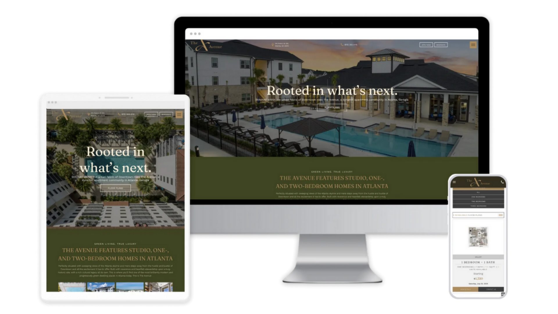
Mobile-friendly websites drive better search engine rankings (remember, Google prioritizes mobile-responsive sites), reduce bounce rates, and increase conversions by making it easier for users to read content and tap buttons without zooming.
Visitors viewing your website on their phone expect a fast experience, readable text, simplified menus, and easy forms. If your website is unreadable, if the menus are impossible to tap, or if the pages load slowly, traffic will be lost.
5. Pictures Aren’t Enough
High-quality photos that show off the property are necessary, that’s true.
But renters not only want more, but they expect it.
Clear floor plan images (with measurements) and 3D tours have also become “the norm” on websites, and are seen as required materials to attract serious leads.
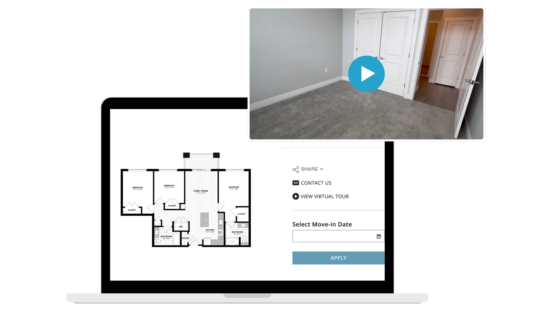
Additionally, they help with lead qualification (renters can understand the flow and scale of a space before committing to a tour) and assist anyone who may not be able to easily tour a space in person.
6. Pestering Pop-ups
Pop-ups can actually hurt website performance in several ways, including:
- Distracting from the core goal (renting apartments)
- Increasing bounce rate (ads can sometimes be annoying)
- Slowing down the website
- Disrupting the mobile experience
Now, take this with a grain of salt, because not all pop-ups are created equal.
Delayed pop-ups (ones that appear when a prospect clicks on the Floor Plans page, for example) can be amazing enticers, and pop-ups that appear when the user is just about ready to navigate away can also tempt them to stay on the website.
If the end goal is to rent an apartment, specials can help, but they may be more beneficial if they are put at the top of the website, on a Google Business Profile post, or even on a separate website page with regular updates.
7. Ignoring Accessibility (ADA Compliance)
While state and local government rules may vary, the Americans with Disabilities Act makes it very clear: website accessibility is required.
Multifamily communities offer a variety of both in-person and online services, and people with disabilities navigate them in different ways. Screen readers, captioning, and voice recognition are just some of the ways persons with disabilities may control their computers and other devices.
Some examples of accessibility barriers include:
- Poor color contrast
- Using color alone to give information
- Lack of text alternatives (alt text) on images
- No captions on videos
- Inaccessible online forms
- Mouse-only navigation
There is no certification for ADA compliance, but you can prove compliance by conducting regular audits and publishing an accessibility statement.
FYI: Every Repli website comes with AudioEye, which helps make our websites accessible to people with disabilities.
The Bottom Line
At the end of the day, every friction point (hidden pricing, outdated availability, a confusing menu, a slow mobile load) is one more reason for a renter to hit the back button and try a competitor instead.
The good news? None of these fixes require a full site overhaul.
Start with an honest audit of your own website through a renter's eyes, tackle the biggest offenders first, and keep testing as you go.
In a market where most searches
never even result in a click, the websites that convert will be the ones that make it effortless to say yes.

ABOUT THE AUTHOR
Tracy is an Organic Media Specialist at Repli, where she helps multifamily marketers turn visibility into velocity. With a background in sales, multifamily, and reputation management, she specializes in connecting SEO strategy, online reputation, and renter behavior to uncover insights that fuel smarter marketing decisions and stronger leasing performance. When she’s not optimizing digital presence, she’s spending time with her family, binge-watching TV, or diving into a good book.
Repli Apartment Marketing Blog
Subscribe to our Newsletter & Blogs
Blog Post Subscribe Form
Share Our Post!
Apartment Marketing Blog